Processing image data to find the dominant colors. Is Seattle as gray as we think?
Overview
In a team, we were tasked with collecting a series of images at a location in Seattle. We would take about three photos a day, at various times of day during one week. After this, I used NumPy to process the images and convert them so that they only contained the top 10 dominant colors. We then took these images and put them into a Pandas dataframe so we could create a data visualization. My partner and I developed a way of automating the image processing so that our code could be as efficient as possible.
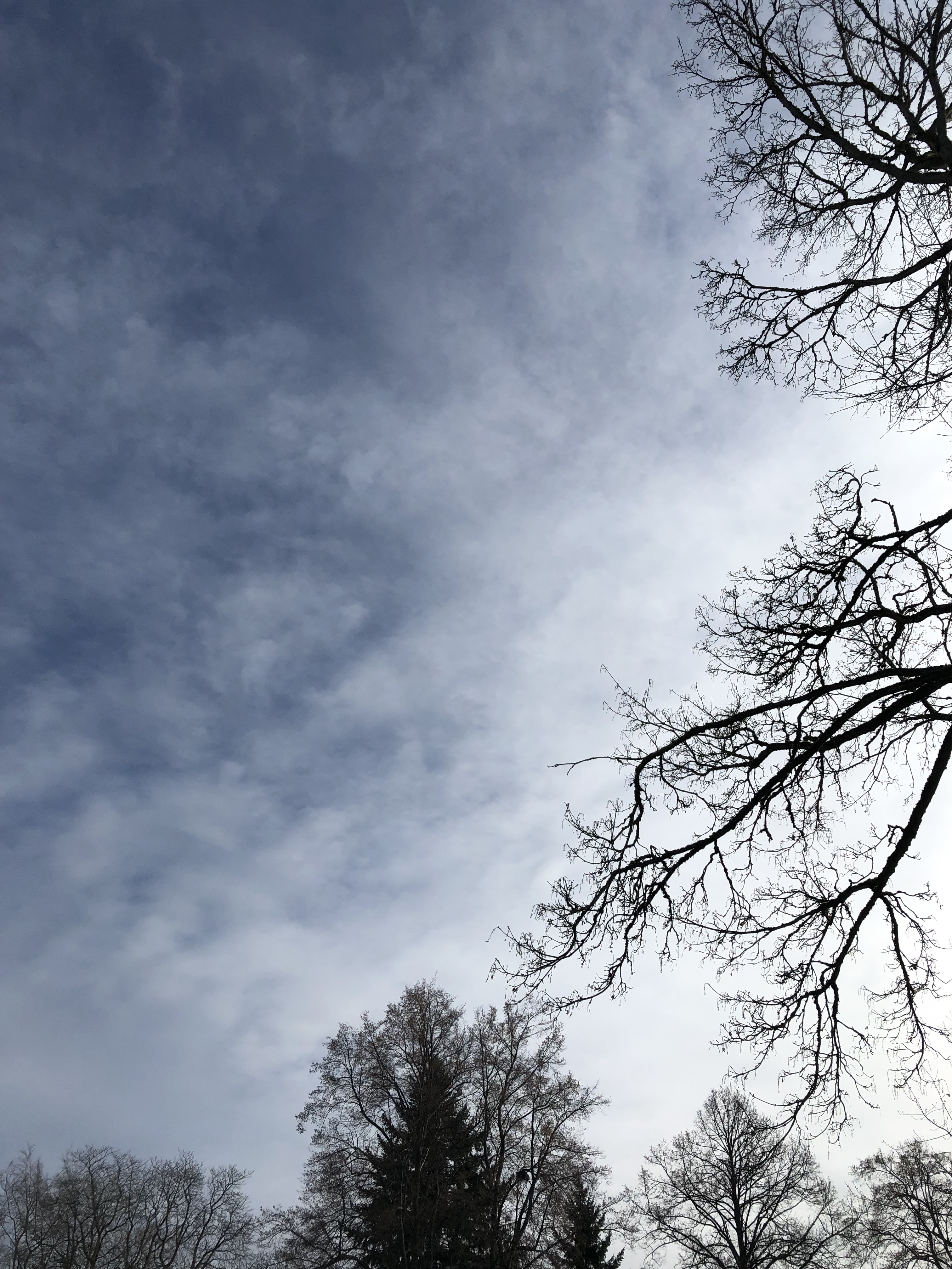
Image Processing
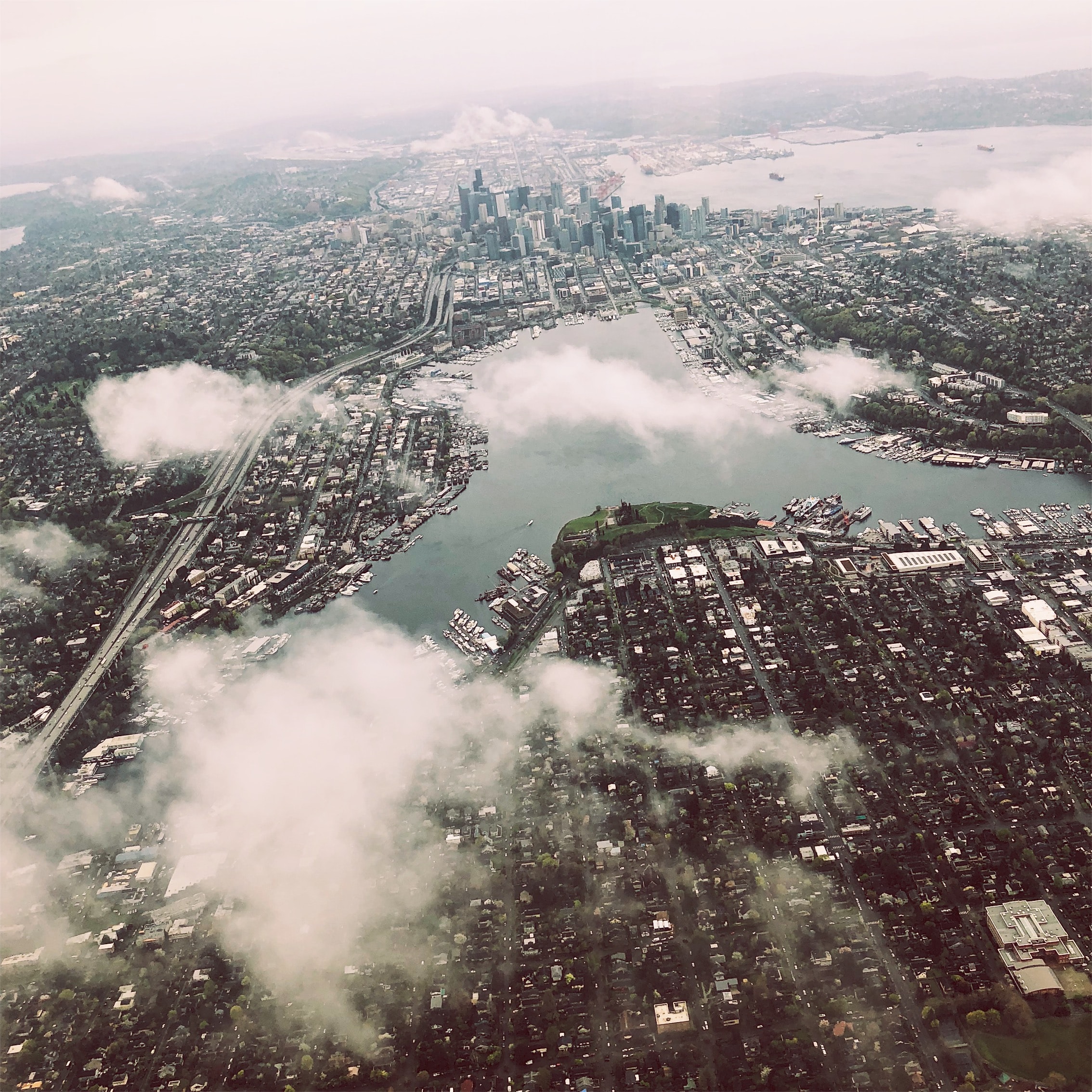
We turned a raw photo like this...

Image Processing
...To a processed image merging the pixels into the top 10 dominant colors.
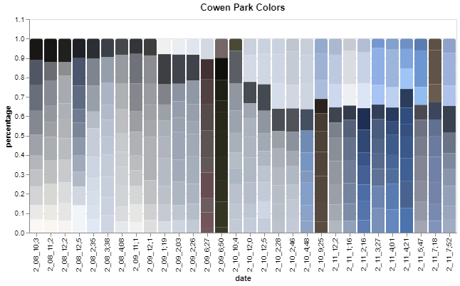
Final Visualization
This infographic also shows the progression of weather during the week and during a certain day. As we can see, February 11th was a beautiful sunny day with clear blue skies for most of the day. If we look at February 8th, we can see that there are hints of blue sky and I infer sun during the afternoon but cloudy weather in the morning and evening. Most people assume Seattle winters are gray and depressing, but as we can see from a week in February that is not the case! There was clear blue sky almost every day in our infographic even if it was only for an hour like on February 10th.
About Me
I am a recent graduate from the University of Washington. I studied Geographic Information Systems with a focus in Data Science. My data science passions include sports analytics (ask my about my fantasy football strategy) and Machine Learning. Outside of programming I love to hike, run ultramarathons and cook! Please reach out to me via email or LinkedIn if you have any questions.